

Hey folks! It’s Disability Pride month, so this month’s devlog is Designing for Accessibility. We’ll be looking at it from a general software lens, so there’s nothing here specific for VTTs.
We’ll be focusing on the things that we currently do, but we’ll also add in a section at the end on future things we’d like to implement.
Let’s learn how we can make our VTTs (and software in general) more accessible!

UI Resizing
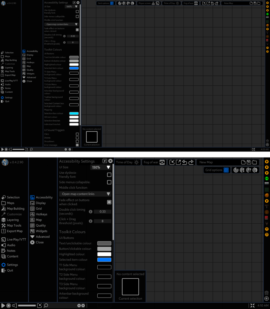
Arkenforge currently allows UI scaling in 4 discrete increments: 75%, 100%, 125% and 150%.
Providing UI resizing options has two major benefits.
- It can allow people with vision issues to more easily read your UI.
- By increasing the size of clickable items, it makes it easier for people with motor function issues to interact with your software.
Adding UI resizing options takes some careful design. Sure, you could just add a UI size slider that goes as high as the user would like, but a larger UI without designing for a larger UI can easily make the situation worse. UI elements can overlap, and text can end up off-screen or wrapping to the point of unreadability.
Implementation
To ensure that everything works well at our largest UI scale, we build all UI at 150%, then downscale from there. It’s significantly easier to downscale a large UI than it is to upscale a small UI. This also lets us see what the largest feasible size for UI is inside the Arkenforge Toolkit, which is why we cap out at 150%. Any larger than that, and you begin to flirt with usability issues.
Right now our UI scaling is uniform. That is, every UI element is scaled by the same amount. In future we’ll be adding in UI scaling on a per-UI basis. This would mean that your widgets could be scaled differently to your Arkenbar, which could be scaled differently to your left-side menu panels. This high level of customisation would improve the experience for our users while allowing for larger UI scaling values.
In order to implement this yourself, you’ll either want to have all of your UI adjust its scale value, or adjust its height and width based on the new scale. We like to do the latter, as it works better with our anchoring.
Recolouring
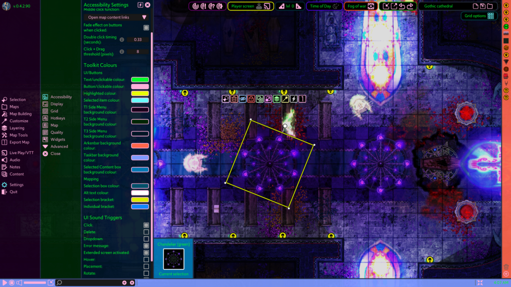
Recolouring UI elements is another accessibility feature that assists those with vision impairment and colour blindness. By allowing users to recolour elements of your software, you don’t need to worry as much about colour-blind modes. Your users will set their own UI colours to best fit their needs.
That being said, your default colour scheme should be colour-blind friendly to start with. Users shouldn’t have to fight against your default UI to set the colours that they need.
Outside of vision impairment issues, recolouring can help with many flavours of neurodiversity. Being able to set colours for different sections of your software can help users to find things faster, and ultimately use your software more effectively.
Finally, you can’t discount the personalisation element. While not a disability-specific benefit, accessible features aren’t just for those that need them. They ultimately help everyone. We’ve seen screenshots from our users with all kinds of different UI colouring. Giving users the ability to set up their software to look how they want it to helps them feel more attached.
Implementation
We use an event system to manage UI recolouring that all UI elements are subscribed to. When a colour is changed, all active UI elements are notified, and they update their colour accordingly. This allows for real-time visualisation of the changes while editing, rather than needing to do an ‘Apply now’ button and having the user repeat the entire process again.
Simulated mouse button toggle
About two years ago now, we had a user reach out with the following info (paraphrased): “My daughter has CP. She struggles to hold down left click and drag a mouse.” With most of our software being built on click-and-drag functionality, this was obviously something that needed addressing.
At the time we had the ability to hold down the spacebar to move selected content (and still do!), but this was also not feasible. Holding down any keyboard key for any length of time was something that would cause pain.
We ended up going with an option to set middle click as a simulated left mouse button toggle. To put it simply, clicking the middle mouse button when hovered over a map object or UI element would put it into ‘dragging’ mode. From here, you could move it to wherever you liked, then click the middle mouse button again to drop it. It took a bit of work to implement into our UI code, but as a result, someone can now use the Arkenforge Toolkit without pain.
Implementation
This one relies on writing your own custom input manager. We do this in Arkenforge to unify input between touch and mouse control for map building, but it also lets us do these kind of accessibility features.
The only part you’ll need to add in is a ‘simulateMouseDown’ bool that flips based on the input of choice (In our case, the middle mouse button). When testing your ‘GetMouseButton’ function, you’ll just need to add in the ‘simulateMouseDown’ value to test as well. If the value is true, then you’re holding down the mouse, and can set up your drag events accordingly. Just make sure that you’re adding a simulated ‘OnMouseDown’ and ‘OnMouseUp’ function as well (depending on the toggle state) when you hit your input, otherwise you end up with a dragging event with no pick up / put down events to go along with it.
OpenDyslexic
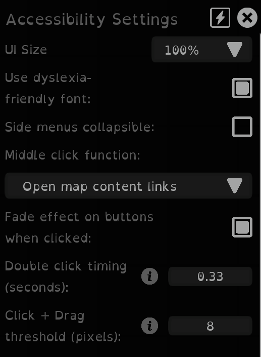
OpenDyslexic is a free typeface designed to help with some of the common issues that those with dyslexia face. Being a free typeface, it’s a simple addition that all platforms can implement.
The Arkenforge Toolkit provides a checkbox that allows users to swap all font to OpenDyslexic.
If you’d like to implement this yourself, you can find the typeface at https://opendyslexic.org/.
Implementation
Arkenforge implements OpenDyslexic in a similar way to its recolouring. All text UI elements in the Arkenforge Toolkit are subscribed to an event that pings when the ‘Use OpenDyslexic’ checkbox value is changed, and update accordingly when the setting is modified.
Double click timing
By allowing users to adjust the speed of a double click, users who aren’t able to click rapidly can more accurately interact with your software. There should be options for this in your user’s operating system settings as well, but adjusting these will adjust the setting for all software on their computer. Providing the option to set this on a per-software basis can allow your users to make the necessary changes in your software without affecting their experience in other software applications.
Implementation
When managing your input system, have a timer start the moment a mouse button is clicked. If the timer is below the double click time threshold, then a double click has occurred. If it’s over, then it’s another single click.
Make sure your double click event is also looking at the distance the mouse has moved, and that the same button is being pressed when calculating your double click. Adding a small allowable distance that the mouse can travel for a double click to occur can also help those with tremors and other such conditions to interact with your software.
Click + Drag threshold
Adjusting the click and drag threshold will change the distance in pixels that a held click with mouse movement becomes a drag.
Users with motor function issues or hand tremors may have trouble with click and drag functionality. For some, the standard value is too low, and they can accidentally drag content when they just want to click. In our software this can lead to placing content in the wrong spot, accidentally creating content links, or accidentally revealing parts of the map.
By allowing users to set the click and drag threshold to a custom value, we can alleviate these issues.
Implementation
For UI, Unity has this built into its EventSystem class already through the EventSystem.current.pixelDragThreshold variable.
When it comes to scene content however, this does not exist. Therefore we need to add it into our custom input manager. It’s quite an easy one if you’re already detecting content dragging. You just need to do a distance check between the current mouse position and the position that the mouse was first clicked.
UI Audio
Sound effects on your UI are more than just some flashy sounds that respond to input. They can be a helpful tool that provide an extra layer of information to your user. In the Arkenforge Toolkit, we use UI audio in a variety of different ways.
First of all, we provide different kinds of UI audio. Each of these can be toggled on or off depending on what sounds the user wants to hear. The following are offered currently in the Arkenforge Toolkit:
- Button Click
- Deleting map content
- Opening a dropdown menu
- Error message
- Extended screen activated
- Hovering a UI element
- Placing a map tile
- Rotating a map tile
- Adjusting a UI slider
- Resizing a map tile
- A tooltip appearing.
We could certainly add more options, but these ones provide a responsive sound effect for every major function of our software.
Rather than just adding the sound effects in, with a little extra work you can increase the accessibility of your sounds. For example, our slider sound will adjust in pitch depending on the fill percentage. This provides simple responsive feedback that can alert a user as to the state of the slider. To go one step further, you can base the sound’s panning on the element’s screen position. In Arkenforge a UI element on the left side of the screen will be louder in the left channel, and one on the right will be louder in the right channel. This is one that we borrowed from, of all places, Animal Crossing. This provides just that little bit of extra feedback to let a user know where the mouse might be on the screen.
Watch the below example with your eyes closed, and see if you can tell which slider is being updated, and to what value.
Implementation
We use a singular UISoundManager class with a PlaySFX function that feeds in the sound type, screen x position, pitch, and volume. From here, it selects the correct sound effect and, if that sound type is enabled, play the sound effect at the correct volume as determined by the UI audio volume slider and the volume variable passed into the function. We also use the screen x position for panning the audio. You don’t want to go from a -1 -> 1 with this, as you frequently end up with audio in only one channel. We max out at 75/25, so there’s always some element of audio in one side. It gives enough of a difference that it’s quite noticeable, while still feeling satisfying in both ears.
Conclusion
These are just some of the ways that you can make your platform more accessible. On top of this, here a few additional accessibility features that you could add into your project.
- Screen reader support, with both text reading and alt-text support for images and buttons.
- Keyboard navigation through UI elements. This is helpful for folks who find it difficult to use a mouse.
- Zoom window. Operating systems should have this as a default feature, but providing a window that can zoom in on UI elements can further help users with vision issues.
I hope this has been a helpful guide, and that if you’re developing your own software that you’ll implement at least some of the above features.
If you’d like to see them in action, check out our Arkenforge Toolkit at https://arkenforge.com!